
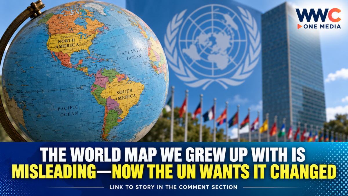
NEW YORK — The United Nations General Assembly has backed a resolution encouraging the world to move away from distorted representations of continental size, putting a spotlight on one of the most familiar images in classrooms, offices and digital maps: the Mercator world map.
The resolution, spearheaded by Togo and supported by the African Union, passed overwhelmingly on Friday, September 4, with 164 countries voting in favor, one against and six abstaining. The United States was the only country to vote against it.
At the center of the initiative is the Equal Earth projection, a 2018 map design that represents the relative surface areas of continents more accurately than the centuries-old Mercator projection.
The vote does not mean that the United Nations has banned the Mercator map or ordered every country, school or technology company to immediately replace it. Rather, the non-binding resolution encourages governments and institutions to consider more accurate projections for education, communications and other uses where showing relative land area matters.
Why Africa looks smaller on the familiar world map
The controversy centers on the Mercator projection, developed by Flemish cartographer Gerardus Mercator in 1569 primarily to aid maritime navigation.
Mercator is particularly useful for navigation because it preserves angles and directions. But that comes with a major trade-off: land areas become increasingly exaggerated as they move toward the poles.
The result is a world map that can dramatically distort how people perceive the relative size of continents and countries.
One of the most striking examples is Greenland. On a conventional Mercator map, Greenland can appear comparable in size to Africa.
In reality, Africa is about 14 times larger than Greenland.
Africa is also frequently perceived as much smaller than it actually is when viewed through Mercator because much of the continent lies closer to the equator, where the projection compresses areas relative to regions at higher latitudes.
Enter the Equal Earth map
The alternative promoted by the UN resolution is the Equal Earth projection, developed in 2018 by cartographers Bernhard Jenny, Tom Patterson and Bojan Šavrič.
Unlike Mercator, Equal Earth is an equal-area projection. Its purpose is to preserve the relative areas of continents, meaning Africa appears much closer to its actual scale relative to Europe, North America and Greenland.
That does not make Equal Earth a completely distortion-free map—no flat map can perfectly represent a spherical Earth. Instead, it makes a different trade-off, prioritizing accurate relative land areas.
This distinction is important: there is no single flat world map that can preserve every geographic property simultaneously.
Some projections prioritize direction, others area, shape or distance. The argument behind the UN resolution is that when the purpose is to communicate the relative size of continents, an equal-area projection can provide a more scientifically appropriate picture.
The vote was overwhelmingly in favor
The resolution received 164 votes in favor, while the United States voted against and six countries—Serbia, Estonia, Georgia, Lithuania, Moldova and Ukraine—abstained.
The U.S. representative characterized the measure as promoting what Washington viewed as an ideological agenda and argued that it distracted from more pressing international issues.
Supporters, however, see the decision differently.
Togo’s Foreign Minister Robert Dussey, who led the initiative, argued that maps influence how people understand the world.
His campaign has framed the issue not simply as a cartographic technicality but as a question of how Africa is perceived in education, media and international affairs.
The African Union had previously endorsed the initiative, with its 2026 decision explicitly noting concerns about the way the Mercator projection distorts the perceived size of Africa and other regions near the equator.
A map cannot change geography—but it can change perception
Supporters of the campaign argue that the consequences of map projections extend beyond geography lessons.
The argument is that repeatedly seeing Africa represented as disproportionately small can subtly influence perceptions of its physical scale and, by extension, how people understand its economic, demographic and geopolitical importance.
The campaign has therefore connected the map issue to broader African efforts to challenge colonial-era narratives and gain greater control over how the continent is represented globally.
Africa No Filter, one of the organizations involved in the campaign, said after the vote that the next objective is seeing more accurate representations used in schools, textbooks, newsrooms, businesses and digital platforms.
But there is an important scientific caveat: the Mercator projection itself was not created simply to make Africa look small or to promote European countries. Its primary purpose was navigation.
The distortions arise from the mathematical challenge of transforming a three-dimensional globe onto a two-dimensional surface.
That distinction matters because critics of Mercator often focus on its visual and historical consequences, while cartographers emphasize that its design had a legitimate technical purpose.
France is also changing its approach
The UN vote comes as France announced that it would move away from Mercator for its own world-map representations.
French Foreign Minister Jean-Noël Barrot said France would favor projections better suited to accurately representing surface areas. France has indicated that it will use the Eckert IV projection, another equal-area projection that provides a substantially different visual representation from Mercator.
The move adds momentum to a campaign that is increasingly being framed as a global discussion about how maps shape public understanding.
What happens next?
The biggest question is no longer whether the UN recognizes the problem of distorted world maps.
It is whether governments, schools, publishers, news organizations and technology companies will actually change what people see.
Togo has said it intends to change its own school geography materials by the end of 2026 and plans to work with other African governments, international organizations and mapping technology companies to encourage wider adoption.
A planned gathering in Lomé involving the African Union, UNESCO and technology-sector participants is also expected to address implementation and broader adoption.
Yet the Mercator projection is unlikely to disappear overnight—and it shouldn’t necessarily disappear everywhere.
For maritime navigation, Mercator remains highly useful because of its ability to preserve directional relationships. The UN-backed initiative therefore represents a push for choosing more appropriate projections for particular purposes, rather than simply declaring one map “right” and another “wrong.”
The bigger picture
The UN vote may appear at first to be about nothing more than a map.
But the debate is ultimately about something much larger: how visual representations influence what people believe about the world.
For generations, millions of students have looked at maps where Greenland appeared enormous and Africa looked comparatively small.
The geography never changed.
The map did.
And now, after centuries of using one particular projection as the default image of the planet, the United Nations has given governments and institutions a powerful reason to reconsider what that image should look like.
WWC ONE MEDIA J.M.S



Leave a Reply